CSS Grid:
The CSS Grid Layout Module offers a grid-based layout system, with rows and columns, making it easier to design web pages without having to use floats and positioning.
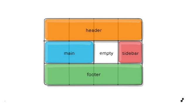
Properties for the Parent ‘Container’
display
-Values: grid - generates a block-level grid inline-grid - generates an inline-level grid grid-template-columns/ grid-template-rows
-Values: - can be a length, a percentage, or a fraction of the free space in the grid (using the fr unit) - an arbitrary name of your choosing grid-template-areas
-Values: - the name of a grid area specified with grid-area . - a period signifies an empty grid cell none - no grid areas are defined
-grid-template - Values: none - sets all three properties to their initial values / - sets grid-template-columns and grid-template-rows to the specified values, respectively, and sets grid-template-areas to none etc…
Properties for the Children ‘Grid Items’
-grid-column-start/ grid-column-end/ grid-row-start/ grid-row-end
-Values: - can be a number to refer to a numbered grid line, or a name to refer to a named grid line span - the item will span across the provided number of grid tracks span - the item will span across until it hits the next line with the provided name auto - indicates auto-placement, an automatic span, or a default span of one
-grid-column/ grid-row - Values: / - each one accepts all the same values as the longhand version, including span etc..
Regular Expressions:
A regular expression is an object that describes a pattern of characters. Regular expressions are used to perform pattern-matching and “search-and-replace” functions on text.
Responsive Web Design:
Responsive website design is an approach used in website design and development, where the responsive web has the potential to change based on the characteristics of the device on which it is viewed.
RegEx Extractor
You can extract emails, proxies, IPs, phone numbers, addresses, HTML tags, URLs, links, dates, etc. Just insert one or multiple regular expressions and sources URLs, and start the process. Extract scrape parse harvest. Usage Examples Extract emails from an old CSV address book. Extract image sources from HTML files. Extract proxies from online websites. Extract URL results from Google.
Done by Omar-zoubi