Responsive Web Design
Responsive web design is the practice of building a website suitable to work on every device and every screen size, no matter how large or small, mobile or desktop. Responsive web design is focused around providing an intuitive and gratifying experience for everyone. Desktop computer and cell phone users alike all benefit from responsive websites.
Flexible Layouts:
Responsive web design is broken down into three main components, including flexible layouts, media queries, and flexible media. The first part, flexible layouts, is the practice of building the layout of a website with a flexible grid, capable of dynamically resizing to any width. Flexible grids are built using relative length units, most commonly percentages or em units. These relative lengths are then used to declare common grid property values such as width, margin, or padding.
Orientation Media Feature:
The orientation media feature determines if a device is in the landscape or portrait orientation. The landscape mode is triggered when the display is wider than taller, and the portrait mode is triggered when the display is taller than wider. This media feature plays a large part with mobile devices.
Flexible Grid:
Take all of the fixed units of length and turn them into relative units. Taking the flexible layout concept, and formula, and reapplying it to all parts of a grid will create a completely dynamic website, scaling to every viewport size.
Media Queries:
Provide the ability to specify different styles for individual browser and device circumstances. Being able to apply uniquely targeted styles opens up a world of opportunity and leverage to responsive web design.
Initializing Media Queries:
Each media query may include a media type followed by one or more expressions. The HTML5 specification includes new media types. When a media feature and value allocate to true, the styles are applied. If the media feature and value allocate to false the styles are ignored.
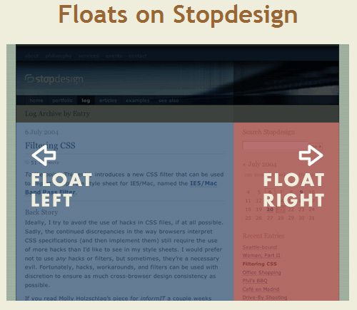
What is “Float”?
Float is a CSS positioning property.
In page layout programs, the boxes that hold the text can be told to honor the text wrap, or to ignore it. Ignoring the text wrap will allow the words to flow right over the image like it wasn’t even there. This is the difference between that image being part of the flow of the page (or not). Web design is very similar.
How to use the float property ?

If you do not want this property to be applied to the rest of the elements you have to use this line of code :
{ clear: both; }