Transforms:
The transform property comes in two different settings, two-dimensional and three-dimensional. Each of these come with their own individual properties and values.
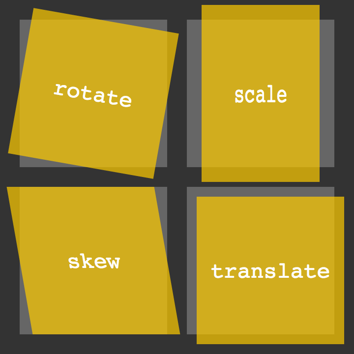
1.2D Transforms#two-dimensional-transforms:
-2D Rotate:
The transform property accepts a handful of different values. The rotate value provides the ability to rotate an element from 0 to 360 degrees. Using a positive value will rotate an element clockwise, and using a negative value will rotate the element counterclockwise. The default point of rotation is the center of the element, 50% 50%, both horizontally and vertically. Later we will discuss how you can change this default point of rotation.
Ex : transform: rotate(20deg);
-2D Scale
Using the scale value within the transform property allows you to change the appeared size of an element. The default scale value is 1, therefore any value between .99 and .01 makes an element appear smaller while any value greater than or equal to 1.01 makes an element appear larger.
Ex: transform: scale(1.25);
-Multiple Scaling Demo:
Ex: transform: scaleY(1.15); , transform: scaleX(.5);
-2D Translate:
The translate value works a bit like that of relative positioning, pushing and pulling an element in different directions without interrupting the normal flow of the document. Using the translateX value will change the position of an element on the horizontal axis while using the translateY value will change the position of an element on the vertical axis.
Ex: transform: translateY(25%); Or transform: translate(-10px, 25%);
-2D Skew:
Ex: transform: skew(5deg, -20deg);
3D Transforms:
Using the rotateX value allows you to rotate an element around the x axis, as if it were being bent in half horizontally. Using the rotateY value allows you to rotate an element around the y axis, as if it were being bent in half vertically. Lastly, using the rotateZ value allows an element to be rotated around the z axis.
Ex: box-1 { transform: perspective(200px) rotateX(45deg); transform: perspective(200px) rotateY(45deg);
transform: perspective(200px) rotateZ(45deg); } for 3 boxs.
-3D Skew
.rotate { transform: perspective(200px) rotateY(45deg); transform-style: preserve-3d; transform: rotateX(15deg) translateZ(20px); transform-origin: 0 0; }
Transitions & Animations:
With CSS3 transitions you have the potential to alter the appearance and behavior of an element whenever a state change occurs, such as when it is hovered over, focused on, active, or targeted. Animations within CSS3 allow the appearance and behavior of an element to be altered in multiple keyframes. Transitions provide a change from one state to another, while animations can set multiple points of transition upon different keyframes.
### As mentioned, for a transition to take place, an element must have a change in state, and different styles must be identified for each state. The easiest way for determining styles for different states is by using the :hover, :focus, :active, and :target pseudo-classes.
Transitions:
There are four transition related properties in total, including transition-property, transition-duration, transition-timing-function, and transition-delay. Not all of these are required to build a transition, with the first three are the most popular.
You can make the changes by hover using :hover method and use ‘transition-duration: TIME’ for the time it take to make the changes
Animations Keyframes:
The most important proparities :
-animation-name: ;
-animation-duration: ;
-animation-iteration-count: ;
possibilities for UX designers:
1. Fade in : to change the opacity;
2. Change color when hover : :hover {background:#53a7ea;}
3.Grow: `grow:hover{-webkit-transform: scale(1.3); -ms-transform: scale(1.3); transform: scale(1.3);}
4. Rotate elements :`.rotate:hover { -webkit-transform: rotateZ(-30deg);
-ms-transform: rotateZ(-30deg);
transform: rotateZ(-30deg); }`
5. Square to circle: .circle:hover { border-radius:50%; }
6. 3D shadow: `.threed:hover {
box-shadow:
1px 1px #53a7ea,
2px 2px #53a7ea,
3px 3px #53a7ea;
-webkit-transform: translateX(-3px);
transform: translateX(-3px); `}
7. Swing
8. Inset border : `.border:hover{
box-shadow: inset 0 0 0 25px #53a7ea; }`
Done by Omar-zoubi