Layout
Building Blocks:
CSS treats each HTML element as if it is in its own box. This box will either be a block-level box or an inline box. Block-level boxes start on a new line and act as the main building blocks of any layout, while inline boxes flow between surrounding text. You can control how much space each box takes up by setting the width of the boxes (and sometimes the height, too. To separate boxes, you can use borders, margins, padding, and background colors.
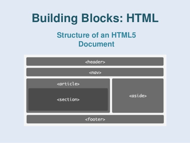
Containing Elements :
If one block-level element sits inside another block-level element then the outer box is known as the containing or parent element. It is common to group a number of elements together inside a <div> (or other block-level) element. For example, you might group together all of the elements that form the header of a site (such as the logo and the main navigation). The <div> element that contains this group of elements is then referred to as the containing element.
Positioning:
Thre kind of positioning.
1.Relative:
Relative positioning moves an element in relation to where it would have been in normal flow.
2.Absolute:
When the position property is given a value of absolute, the box is taken out of normal flow and no longer affects the position of other elements on the page. (They act like it is not there.)
3.Fixed:
Fixed positioning is a type of absolute positioning that requires the position property to have a value of fixed.
Fixed Width Layouts:
Fixed width layout designs do not change size as the user increases or decreases the size of their browser window. Measurements tend to be given in pixels.
Advantages:
1.Pixel values are accurate at controlling size and positioning of elements.
2.The designer has far greater control over the appearance and position of items on the page than with liquid layouts.
3.You can control the lengths of lines of text regardless of the size of the user’s window.
4.The size of an image will always remain the same relative to the rest of the page.
Disadvantages:
1.You can end up with big gaps around the edge of a page.
2.If the user’s screen is a much higher resolution than the designer’s screen, the page can look smaller and text can be harder to read.
3.If a user increases font sizes, text might not fit into the allotted spaces.
4.The design works best on devices that have a site orresolution similar to that of desktop or laptop computers.
5.The page will often take up more vertical space than a liquid layout with the same content.
Liquid Layouts :
Liquid layout designs stretch and contract as the user increases or decreases the size of their browser window. They tend to use percentages.
Advantages:
1.Pages expand to fill the entire browser window so there are no spaces around the page on a large screen.
2.If the user has a small window, the page can contract to fit it without the user having to scroll to the side.
3.The design is tolerant of users setting font sizes larger than the designer intended (because the page can stretch).
Disadvantages:
1.If you do not control the width of sections of the page then the design can look very different than you intended, with unexpected gaps around certain elements or items squashed together.
2.If the user has a wide window, lines of text can become very long, which makes them harder to read.
3.If the user has a very narrow window, words may be squashed and you can end up with few words on each line.
4.If a fixed width item (such as an image) is in a box that is too small to hold it (because the user has made the window smaller) the image can overflow over the text.
Summray :
The float property moves content to the left or right of the page and can be used to create multi-column layouts. (Floated items require a defined width.)
Pages can be fixed width or liquid (stretchy) layouts.
Grids help create professional and flexible designs.
CSS Frameworks provide rules for common tasks.
Links : Links are the defining feature of the web because they allow you to move from one web page to another — enabling the very idea of browsing or surfing.

Links are created using the element.
The element uses the href attribute to indicate the page you are linking to.
If you are linking to a page within your own site, it is best to use relative links rather than qualified URLs.
You can create links to open email programs with an email address in the “to” field.
Done by Omar-Zoubi